
Marketing & Transactional Mail.
From 3.5" x 5" to 6" x 11" postcards, to full kitted packaged letters and flats, we can support your business needs. We offer a complete line of fully secure, transactional mail services.

Postal Optimization.
Smart Entry Services ranging from simple commingle to complete COPAL services are available with one goal in mind; save on postage and increase your bottom line. Our expert postal solution architects aim by reducing the cost of mailing, improving the efficiency of the mailing process, and increasing the effectiveness of your mail campaign.

List & Data Services.
We can provide highly-targeted mailing lists for your campaigns. These lists include consumer, occupant, and business data. Our consumer data features Audience Targeting which are selects designed to predict consumer behavior as well as product and brand affinities.

Programmatic Mail.
With DMAPI (Direct Mail API), you can integrate your entire mail and print production strategy, in as little as 2 days. The DMAPI enables you to seamlessly integrate CRMs and marketing channels allowing you to send triggered campaigns whether it be 1 piece or 10 million.
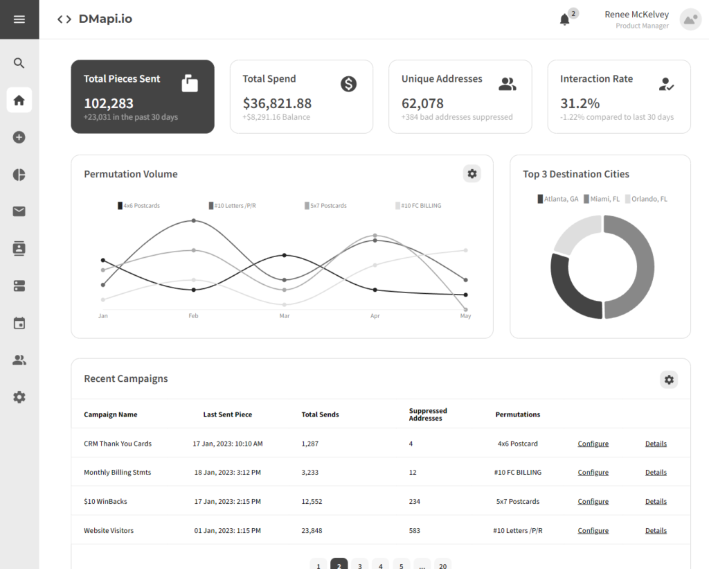
Track all your spend in one easy to use place.
Create Campaigns on the Fly
Advanced Real-Time Analytics
Build physical mail templates
on our many types of permutations
and send immediately.
Upload and Scrub
your Mail File Automatically.
Don't waste another
penny on mail that will only be returned.
Purchase Mailing Lists,
Build Custom Creative and many other premium
services are offered on the fly.
Schedule and Cancel Campaigns.
Add unlimited users to manage your mail.
Create API Keys, Payments and More 24/7.
Real-Time Suppression of Addresses.
Edit and Reconfigure Campaigns on the fly.
Build tracking URLs and PURLs,
with QR codes and variable
tracking data and track interactions.
Real-Time Webhooks and
notifications to allow you to
do anything you'd ever want
with the data.